
The Strategy Dashboard consolidates four complementary views to provide end-to-end visibility from strategy to execution:
-
Finance Performance
-
Risk Performance
-
Strategy Performance
-
Project Performance
Each view can be displayed:
-
Across all Strategic Goals (global execution visibility), or
-
Focused on one Strategic Goal (targeted view on its initiatives and outcomes)
🔍Overview - Finance Performance
The Finance Performance Dashboard in AIZOPlan provides executives and strategic leaders with a consolidated, real-time view of financial performance across the enterprise.
It shows how budgets, investments, and actual spending flow across strategies, portfolios, programs, and projects, enabling leaders to connect financial decisions directly to strategic outcomes.
This dashboard helps answer key executive questions:
-
Are we investing in the right strategic priorities?
-
Are OPEX and CAPEX aligned with strategic goals?
-
Where do we see overspending, underspending, or financial tension?
-
How efficiently are funds consumed across portfolios and programs?
AIZOPlan transforms raw financial data into actionable financial intelligence, enabling leaders to optimize investments, anticipate risks, and ensure every dollar contributes measurable strategic value.
📌 Access the Finance Performance Dashboard
Navigate to the main menu: Strategy > Track > Strategy Dashboard
Then select Finance Performance from the list of Dashboards.
You may switch between:
-
All Strategic Goals, or
-
One selected Strategic Goal
depending on the scope of your analysis.
📌 Explore the Finance Performance Components
1️⃣ Financial Summary Cards
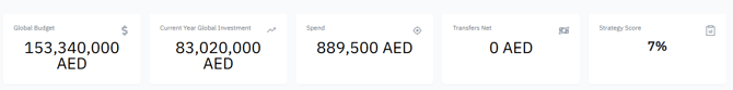
These indicators provide an immediate, executive-level snapshot of enterprise financial health.
-
Global Budget
Total approved budget for the selected period, representing the financial envelope available for strategic and operational initiatives. -
Current-Year Global Investment
Portion of the multi-year budget already committed to investments for the current year, helping assess alignment with annual objectives. -
Spend
Total actual consumption of committed investments.
A high Spend-to-Investment ratio may indicate accelerated execution or potential overspending pressure. -
Net Transfers
Transfers between portfolios or budget sources.
Significant inflows or outflows often reflect reallocation pressure or shifting priorities. -
Strategy Score
Average performance of all Key Results linked to the selected Strategic Objectives, creating a direct link between financial posture and strategic progress.
2️⃣ Budget vs. Investment vs. Spend
This chart compares three essential financial layers:
-
Budget → Approved multi-year funding envelope
-
Investment → Funds committed to execution
-
Spend → Actual financial consumption
It provides insight into CAPEX and OPEX dynamics
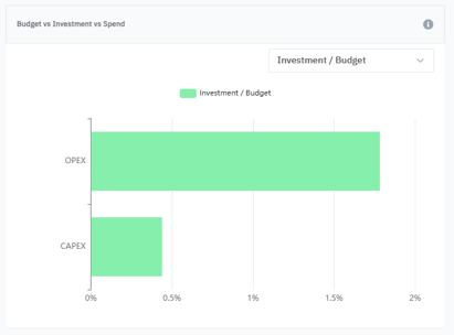
Use this view to:
-
Detect over- or under-investment
-
Monitor execution vs. financial commitments
-
Identify early overspending or delayed investment
-
Support reallocation and optimization decisions
Common signals:
-
High OPEX consumption may indicate operational pressure
-
Low CAPEX execution may reveal delivery or dependency delays
3️⃣ Transfers Net & Flow
This visualization shows:
-
Total transfers
-
Internal inflows
-
Internal outflows
-
Net flow
Across:
-
Strategies
-
Portfolios
-
Programs
-
Investment sources
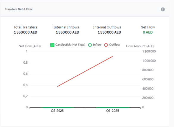
How to interpret trends:
-
Rising trend → receiving more funding
-
Falling trend → sending out funds or reallocations
-
Stable trend → balanced distribution
Why it matters:
-
Identifies portfolios under financial pressure
-
Supports transparent reallocation
-
Ensures funding follows strategic priorities
4️⃣ Investment Distribution Heatmap
The heatmap shows how investments from budget sources are allocated across portfolios.

Color legend
-
🔴 Red – Over-utilized (>100%)
-
🟠 Orange – High utilization (80–100%)
-
🟡 Yellow – Moderate utilization (50–80%)
-
🟢 Green – Low utilization (<50%)
-
⚪ Grey – Not utilized
Use this heatmap to:
-
Spot overfunded or underfunded portfolios
-
Detect unhealthy distribution patterns
-
Justify new funding or capacity needs
-
Align funding with strategic priorities
🔍 When to Use the Finance Performance Dashboard
This dashboard is especially valuable for
-
Quarterly and executive business reviews
-
CAPEX/OPEX governance
-
Funding optimization decisions
-
Executive-level strategic prioritization
-
Early detection of financial risks
-
Ensuring investment–strategy alignment
✅ Summary
The Finance Performance Dashboard provides:
-
Full transparency on enterprise financial health
-
Early detection of overspending and inefficiencies
-
Clarity on how funds flow across the organization
-
Evidence-based decisions for strategic funding
-
An integrated view supporting Lean Budgeting
With AIZOPlan, organizations move from reactive budgeting to strategic investment governance.